 E G R O P O N T E
Contraintuitive
I finally switched to Wintel. And what angers me most about the move is that Apple forced me into it.
One compelling reason for the change: With the Macintosh's shrinking market share, no start-up or single entrepreneur can feel confident basing his or her work on the Mac; even kids shy away from it, preferring what many children insist are more "serious machines." Another reason, well emphasized by the press, is the low and decreasing number of old third-party developers, and the utter absence of new ones. Yet another reason: Mac software and peripherals are far too few in number; even worse, when they do appear, it's much later than the competition. People concerned about tomorrow just cannot settle for the tools of yesterday. Finally, and unfortunately for Apple, its last-ditch efforts to leap back on the leading edge - the G3-based Power Mac and PowerBook; the iMac, "the Internet-age 'computer for the rest of us'" - are far too late, if not too little. "Pro, Go, Whoa"? No. I already think different.
So, sadly, I switch away from a system that I used for almost 15 years, at least three hours a day, seven days a week, without ever once in all those years having read or even opened a manual.
The nightmare begins.
Windows as a snowboard
Learning to snowboard is considerably harder if you know how to ski; in
fact, the first day requires enormous humility from the otherwise seasoned
skier. But after two or three days, your balance overcomes the "unnatural"
counterintuitive moves you must make.
By contrast, after six months I am still falling all over the slopes of Windows, in total disbelief at the collective complexity and unbelievable inconsistencies introduced by all parties involved. This is an indictment of not just Microsoft, but the entire community of software and hardware developers who have done such a bad job of making usable and explainable systems - so much so that I'm convinced, in dark moments, that some of this is purposeful.
A slightly more charitable view follows.
Windows as ugly reality
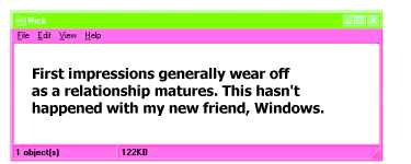
First impressions die hard. In fact,the initial shock of seeing something
completely strange and new sometimes outlasts the relationship. In the
world of humans, the cause can be something as minor as crooked teeth or as
major as missing limbs. It can also be self-imposed body modification,
which might include hair color, nose rings, or tattoos. In any case, the
impact wears off eventually. The better and better you get to know the
person, the more you see through the malformation of first impression.
Ultimately, the unsightliness disappears almost totally in favor of the
person's mind and personality.
So far, that has not happened with my new friend Windows.

Windows as a city
Driving in a city for the first time, you are completely dependent on road
signs. And far too often the most important one is behind a fully blossomed
tree, is unlit at night, has changed names without notice, or uses
nomenclature that is understandable only if you know the city. If you are a
resident, of course, you never notice these inconsistencies, because you
don't use signs to navigate. You already know where you are, where you're
going, and how to get there.
Though some cities try to use universally recognized, "intuitive" road signs, the city of Windows certainly needs to be much more friendly to nonresidents. System designers take note: It is time to test-drive your grandmothers.
Past the age of innocence
As a professor and lab director, my job includes forgiving all sorts of
defects and omissions in favor of encouraging the positive elements of new
ideas and their imaginative demonstration. Frequently the very innocence of
the application design is part of its beauty. Nonetheless, the sad truth is
that a great demo at the Media Lab is often refined to death, thanks to the
natural human instinct of falling in love with your creation, refusing to
let go, and wanting to make it better and better, ŕ la Pygmalion.
Almost without exception, however, the most recent release of any software product is slightly worse than what it's replacing. This is true on the Mac as well. Take a deep breath and repeat after me: Leave it alone. Well intentioned ameliorations have turned elegant solutions into bloated programs, the "upgrade" often being that you can do almost the same thing in five or more different ways, with inconsistent results. The user is second guessed so much nowadays that a simple typo can set your computer into disastrous motion. Each time I try to position my cursor in Word, I enter into an argument about what I mean - it is so clever! Yet something as basic (to Mac users) as click versus doubleclick is not handled consistently. Puh leazzze.
On the other hand, surely it is possible for software designers, in and outside Microsoft, to be consistent about such simple tasks as exiting, quitting, or closing a program - three words should not be license for three ways of doing the same thing. Also, of particular annoyance is the complexity of establishing a modem connection while on the road - huge effort is required to outsmart the smart dialer, which is so stupid as to assume you will dial long distance.
But it is purposeful, dummy
Thus contraintuitive, not counterintuitive. Every software company has a
Department of Guaranteed Revisions, real or fictitious, assigned the all
important mission of securing future sales. This doesn't mean updates and
bug fixes - which ought to, but don't necessarily, come free. It means new
features. Therein lies the problem.
Looked at one by one, these new features may have some merit to some people. But as they grow in number, a simple boxwood hedge starts looking like a jungle of poison ivy.
In an effort to hack through it all, I installed AltaVista to search my disk drive. Alas, it cannot open most of the files, and it sends me through four painful hunt-and-clicks to finally choose one out of 53 programs to open the file. This army of "viewers" is presented through a tiny window that allows you to see no more than seven items at once, as you scroll, in my case, to WordPad, the bottom of the list.
At least it works half the time. Still, if there is anything that a computer should know better than me, it is how to open a file. I guess that is the next release.
Next: Rural One-Room Schools
[Back to the Index of WIRED Articles | Back to Nicholas Negroponte's Home Page | Back to the Media Lab Home Page]
[Previous | Next]
[Copyright 1998, WIRED Ventures Ltd. All Rights Reserved. Issue 6.08, August 1998.]