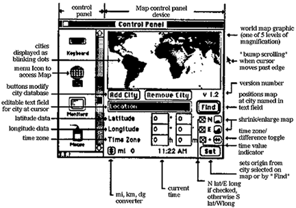
Figure 1: The original Map interface
Computer programmers and graphic designers appear to operate in distinctively different worlds. Yet as computer systems become more graphic and communications media more interactive, experts in the two disciplines find themselves increasingly called upon to deal with the same subject: the design of interactive graphical software. Can this shotgun marriage be made to work?
The literature provides little documentation of the actual analysis and decision-making processes used by programmers and graphic designers in the development of interactive applications. Each profession has a stereotypical view of the other: graphic designers are "beautifiers" who make things look pretty after they are made to work; programmers are "feature-freaks" who could care less how a thing looks as long as the code is elegant. Such stereotypes don't arise from thin air, but we felt ourselves to be exceptions to them--new members of the rare species of eclectic interface designers. Nevertheless, we wondered if the thinking styles lampooned by the stereotypes might lurk beneath the surface of our brave new ethos. We resolved to find out.
Arent is an experienced graphic designer in the Human Interface Group at Apple Computer, where his primary role is to improve visual communication in interfaces. Lieberman is an experienced artificial intelligence researcher (and programmer) who is currently working in the area of interactive tools for graphic design. I (Vertelney) posed Arent and Lieberman a user interface problem--the redesign of the interface of an existing Macintosh control panel module called Map--and recorded their thought processes as they worked on it. I limited the two sides to exactly four hours to perform the design task in hopes of forcing the key issues to the fore.
When I got together with the two sides to compare notes after the design task was accomplished, I discovered both common ground and radical differences in their approaches. This experience, I think, can function as a parable for others, and it suggests that an actual comparative study of the design process, under controlled conditions accompanied by user testing, might provide extremely useful insights for both the software and interface design communities.
The design example, Map, is an interactive interface to a database of cities represented by visual points on a world map. In this program, the user may view latitude, longitude, and time zone information for any location selected on the map. Once a location is established, the user can view time and distance difference information between it and another location. We started with an implementation that was originally designed by a programmer without feedback from graphic designers, then considered how it might be redesigned (see figure 1).

Figure 1: The original Map interface
I chose Map because it is representative of the typical problems interface designers encounter on a daily basis. The original programmers labored under the constraints of a Macintosh control panel module[1]. This meant it had to fit in a small fixed rectangle of screen space, and such interface luxuries as pull-down menus were prohibited. These constraints, together with the Macintosh interface guidelines, forced compromises that may have adversely affected the quality of the interface. Nevertheless, these are the kinds of trade-offs that interface designers face constantly. There are always some resource constraints, be they of limited development time, screen space, memory, processor speed, or just the complexity of the interface itself. As Chris Crawford argues eloquently (see Crawford's chapter in this volume), the process of grappling with constraints often can lead to design creativity. As you will see, each interface designer approached the constraints from a different perspective.
What were the areas of the interface analyzed by the two interface designers, what were the perceived problems, and what paths did they follow in terms of resolving those problems?
The problems and their solutions can be mapped onto three primary criteria in software interface design:
As you will see in the following text and visual examples, the graphic designer and the programmer approached the Map redesign problem by concentrating in different proportions on each of the criteria.
USABILITY
In a typical "we need it yesterday" design situation, Arent, the graphic designer, started the redesign process by assuming the given functionality and application type of Map. He also assumed the constraints of the Macintosh interface; that is, he followed the guidelines for consistent "look and feel" with the rest of the Macintosh interface. He looked at how the existing interface could be improved. Arent began to critique the interface by imagining scenarios of different users interacting with Map for the first time and immediately discovered some usability questions: "What do the random blinking dots on the map (cities in the database) indicate-- can I easily interact with them?"; "How can I get other views of the map, such as a magnified view or a view of the parts of the default map that are not visible?"; "What does the Set button set?"; "Once location and time information are determined for one city, how can I compare it with information from another city?" (see figure 2).
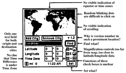
Figure 2: Arent's critique of the existing Map interface
In contrast, Lieberman initially performed none of the steps Arent performed. He did not make an element-by-element critique of the original interface, nor did he analyze it for consistency with the interface guidelines. He simply threw it out.
What irked Lieberman was that he thought the original interface did not satisfy a user's needs, rather than that it contained troublesome elements or violated interface guidelines. This was especially bothersome to him because he saw himself as the kind of user such an application would be intended for. He reconceptualized the problem in terms of his own needs, and proposed an alternative design.
Lieberman: As a frequent traveler who must sometimes work on the road, I could sympathize with a potential user who uses Map during travel. The most serious conceptual deficiency I found was the underlying assumption that there would be a single destination city. Rather than set the origin each time I change location, I would rather program an entire multiple-destination itinerary in advance, including my estimated departure times. The system should automatically change the origin city as I travel from place to place, by reading the system clock.
Although the multiple destination idea seemed to offer a genuine breakthrough in the usability of the program, Lieberman did not develop it further due to the time constraints (a situation often faced in the "real" design process). Instead, he chose a compromise solution to usability problems: he replaced the single map and city display with two independently scrollable maps and displays (see figure 3).
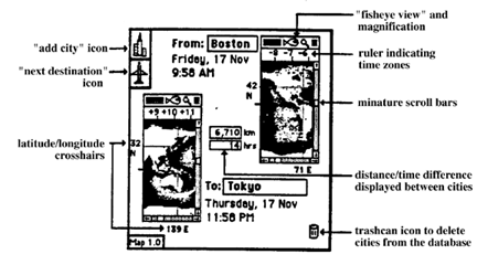
Figure 3: Lieberman's redesign of the Map interface
FUNCTIONALITY
Arent began using the controls to see if he could understand the functionality of Map. Some controls were invisible, some were hidden, some had nonstandard representations, and others were unclearly labeled. To evaluate the various functions, he laid out all the functional components of the Map interface in a schematic diagram. As a result of the schematic, he decided not to add to the functionality but rather to eliminate a couple of components that he felt were of low priority, such as the time-zone indicator and mile/km/degree converter, in order to make better use of the constrained screen space allotted to Map (see figure 4).
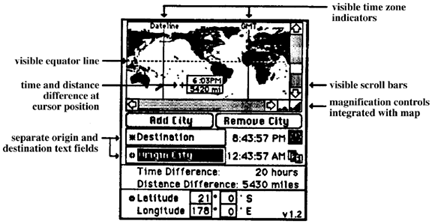
Figure 4: Arent's redesign of the Map interface.
Arent: I mapped out both the visible and hidden components' parts in a schematic diagram. I then began questioning their functionality as well as their spatial arrangement and representation. I discovered that Map was much more powerful and complicated than I had anticipated. There was plenty of opportunity to simplify it both functionally and visually.
Lieberman, meanwhile, decided not only to improve the usability through a radically different conceptual layout of the functionality but also to add to the functionality. He decided to add controls in the form of icons to add destination cities easily as well as to switch to the next origin/destination city combination in the case of multiple destinations. He also added a trash can icon as a means of deleting unwanted cities in the database. Finally, he embellished the two map displays with a ruler-like indicator displaying time zone information.
Lieberman: I felt strongly that both the origin and the destination information should be visible at once, rather than having to toggle between them. Having just one map always hides the information about the other city and confuses the user about whether he or she is in "origin mode" or "destination mode." Having two maps makes the relationship between the cities more visually apparent.
Given the time and space constraints, the real functionality issue for both the graphic designer and the programmer was trade-offs. In order to overcome space constraints and make Map a more powerful tool, Lieberman implemented what Arent termed "Macintosh slang." For example, Lieberman miniaturized the scroll bars (at the cost of making them smaller targets for mouse clicks) to enable two map views to fit into his new conceptual layout. He also used icons in the title bar of each map and stole the trash can icon from the Desktop (see figure 3). Such decisions are heretical to the Macintosh Interface Guidelines, but Lieberman felt they were justified.
To maintain the traditional "look and feel" of the Macintosh interface, Arent adhered to the standard Macintosh conventions. His efforts to improve the interface were concentrated primarily on simplifying functionality; that is, establishing two text fields for simultaneously displaying the names of the destination and origin cities as well as developing a clearer spatial arrangement of the visual elements (see figure 4).
VISUAL COMMUNICATION AND AESTHETICS
How did the graphic designer repair the visual communication and aesthetic problems he found with Map? Arent's redesign proceeded in two stages. In the first stage, he used the schematic layout of all the visual components and concentrated on the communication aspects of the interface.
Arent: What is each interface element trying to communicate to the user? Are users likely to have the same interpretation of each element as the designer intended? Are elements that are trying to communicate related concepts in close spatial proximity to one another? How do all the visual elements work together in the context of the total layout of the interface?
The elements that didn't pass the test were replaced, wherever possible, with those drawn from the standard Macintosh user interface conventions. A second design stage was necessary for spatially organizing all the elements and arranging them to fit in the size-constrained screen space. Figure 5 shows four successive views of the final interface layout with "backtracking" occurring between the third and fourth views to make room for necessary interface elements that didn't fit.
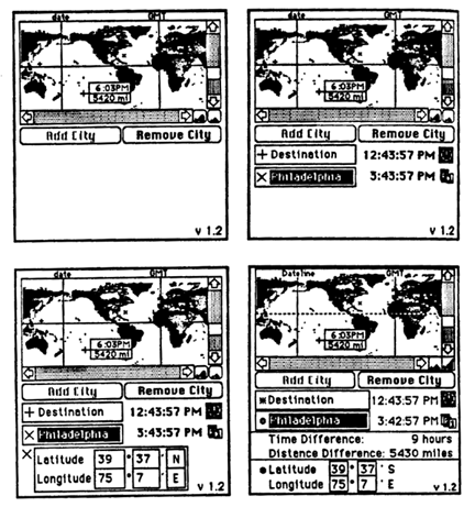
Figure 5: Progression for Arent's redesign. Note backtracking between the third and fourth stages
On many occasions, information could be displayed either iconically or as text, at the discretion of the designer. Surprisingly, the programmer's design made more extensive use of pictorial information in some ways than that produced by the graphic designer.
Lieberman: I resolved to show as much information visually on the map as possible, rather than off in separate text boxes. To indicate latitude and longitude, I put crosshairs on the map, labeled with the numerical values. I felt there should be some graphic indication of time zones, so I used a "ruler" similar to those found in drawing programs. Greenwich and the Date Line would be indicated on the ruler. More accurate would be to draw the time zone boundaries directly on the map.
The graphic designer indicated that he did not feel compelled to use graphics in every possible situation. Sometimes the functionality of a button labeled with text is more immediately understandable by the user than an icon whose meaning is subject to interpretation and learning. But this argument depends on the recognizability of the icon and whether the software is distributed across national or cultural boundaries.
Even when the respective designers were trying to accomplish the same goal, the designs differed--and each designer could offer a plausible justification for his choices. For example, Lieberman decided to reverse the colors of land and water on the map.
Lieberman: I drew the maps with oceans represented as black and land as white. I wanted the most important semantic relationship, namely cities on land, to be rendered as black on a white background, as is most Macintosh graphics and text.
But Arent took a graphic designer's perspective and chose to focus on the visual effect of the color choices.
Arent: Black was used for land masses as a means to emphasize the city dots; that is, white dots appear larger and more prominent on a black background than black dots of the same size do on a white background.
How does one decide which of these seemingly equally justified but conflicting choices is correct? This dispute cannot be resolved a priori, so the experimental approach of user testing is called for. See the article by Gomoll in this book for a detailed discussion of user testing and its effect upon design decisions.
WHERE DOES THE "USER'S VIEWPOINT" COME FROM?
Both designers tried to be sensitive to what they thought was "the user's viewpoint," but just how did they decide what an eventual user might think? An interface designer might look to three possible routes to the user.
First, interface designers can consider themselves as potential users. This is what Lieberman did. How well this works depends upon how closely the interface designer's experience and interests match those of a majority of "real" users--that is, potential buyers of the products. When there is a good match, the close coupling of designer and user viewpoints can result in an excellent design. Lieberman's travel and interface design experience worked fairly well in this case, but this approach is fraught with danger. The problem is that programmers are usually too expert, and can easily fail to empathize with the needs of beginning or occasional users.
Second, interface designers can simulate potential users. Designers can go through the exercise of pretending to be a user and step through what they perceive to be typical user scenarios. This can reveal problems and opportunities that would otherwise be ignored. That is how Arent approached the problem. His relative lack of programming expertise was in fact an advantage during this process, as it more closely approximated the computer skills of typical users.
But neither of these alternatives is as reliable as actually asking real users! Significantly, it occurred to neither of the design teams to query real users about any of the issues they were considering. Again, it's somewhat unfair to expect them to, because the exercise was not set up to accommodate user testing. But again, there's perhaps a lesson in that, because user testing needs to be planned into the design process from the start. The role of well-planned and well-executed user testing throughout the design process cannot be overemphasized.
This point was driven home to us when we later posed the same design problem to another programmer, an experienced developer of commercial Macintosh software. Almost at the start of his design process, he made provision for something that, we were embarrassed to admit, was not only absent in the original but was totally ignored in all of our redesigns--Help. Despite the fact that we all share a belief in the need for good documentation, we had all failed to consider what would happen if the user didn't know what to do next. Certainly, user testing would have uncovered this problem at the first sign of confusion.
WHEN IS IT RIGHT TO CHANGE THE RULES?
After seeing Lieberman's design, Arent complained that Lieberman wasn't playing by the (unspoken) rules. His design departed so much from the original that the graphic designer felt almost tricked. He felt that had he been explicitly given the option of a total redesign, he too would have come up with something radically different. He did not see it as his task in this exercise, nor are interface designers routinely given that option in practice.
But that's just it! If an interface is not meeting the user's needs, it doesn't matter how well-designed, aesthetic, or consistent it is --it's just wrong and needs to be redesigned. Lieberman's challenge to the problem drew praise from Don Norman as "standing up for the user" (see Norman's chapter in this volume). The lesson is that interface designers should always consider it their job first and foremost to meet the user's needs, rather than simply to implement a certain set of features or a certain interface style.
There's another lesson here as well. Arent was also justified in claiming that graphic designers are often put in a difficult position. In many organizations, graphic designers are often treated as "firefighters"--called upon in an emergency to repair disasters not of their own making, under severe time constraints. This situation precludes the kind of comprehensive redesign that Lieberman attempted.
Programmers and managers have a tendency to feel that the role of the graphic designer is to provide cosmetic improvement; that is, to "pretty it up after the programming is done." Graphic designers see their role in broader terms--the design of visual forms to facilitate communication. This broader role encompasses the behavior of an interface as well as the way in which its appearance affects communication. Graphic designers can and should be involved in conceptual-level interface design decisions.
As a result, was Lieberman's redesigned interface better than that produced by Arent? Not necessarily. The graphic designer's training and expertise in visual communication made some aspects of his interface decidedly superior. Some users we consulted informally showed a strong preference for Arent's version. Lieberman eventually ran afoul of both some accepted visual design practices and the Macintosh user guidelines. Other differences reflected fundamental trade-offs that depend upon priorities and tastes.
Related to the issue of challenging the specifications is that of adherence to a set of standard conventions for interaction. The success of the Macintosh is due in no small part to the consistency of its user interface (see Tognazzini's chapter in this volume), which makes learning and using of the computer much easier. But slavish adherence to a set of rigid conventions can also be a damper to realizing optimal functionality and effective visual representation.
Interface guidelines, such as those formulated for the Macintosh, may constrain the exercise of creativity, but they can also be of great value to the designer. They both express and help to set user expectations through consistency, allowing the designer more reliably to predict user behavior. They also remove at least some of the burden of making trade-off decisions from the individual designer's shoulders. Even when a designer decides to "break the rules," it is worthwhile to analyze the rule being broken to discover its original purpose and to predict the effects of violating it.
Our results were less dramatic than they might have been in that both the graphic designer and the computer scientist produced designs that failed to elicit any really serious negative criticism from the other camp. They also failed to exhibit strong biases commonly held to be stereotypical of people of their professions.
One might have expected a hard-core programmer to propose a command-line interface devoid of visual interaction. This might indeed have happened had we chosen programmers whose experience was primarily with mainframes. One might have expected the graphic designer to spend all his effort on appearance and display some naiveté about the functionality of interaction. This might indeed have happened had we chosen a graphic designer whose experience was limited to print media.
That each designer did show some sensitivity to concerns usually thought of as the other's domain we attribute to the fact that a new discipline of interface design is emerging where the need for both perspectives is acknowledged. The chapter by Scott Kim in this volume is a manifesto for this kind of interdisciplinary collaboration. The best work in interfaces will come from those who bring the best of both graphic design and computer science approaches to interactive graphical software.
Acknowledgments
Lieberman's research was supported by a grant from Hewlett-Packard. The Visible Language Workshop is supported by grants and equipment from HP, Apple, DARPA, IBM, NYNEX, and Xerox.
We would like to thank Joy Mountford for initiating the collaboration among us, and Brenda Laurel, Chris Crawford, Don Norman, Scott Kim, Christopher Fry, and Muriel Cooper for helpful feedback.