Henry Lieberman
Media Laboratory
Massachusetts Institute of Technology
Cambridge, Mass. USA
lieber@media.mit.edu
Because AI techniques have usually been applied in such areas as medicine or engineering rather than visual design, little is known about how design knowledge might differ from knowledge in other fields. I conducted an informal knowledge engineering study to try to understand how knowledge is communicated between humans in graphic design.
Nowhere is the process of design communication more critical than in teaching beginning designers, since the effectiveness of the communication is crucial to the success of the student. I surveyed books intended to teach graphic design to novices, and tried to analyze the nature of the communication with a view toward applying the results to a knowledge acquisition system for graphic design applications. This paper reports what I learned.
KEYWORDS: Graphic design, visual communication, knowledge acquisition, learning from examples.
To investigate how designers communicate their knowledge, I surveyed how design knowledge is communicated to students in introductory design books. The results of this informal investigation were quite surprising to me. The books generally present copious selections of graphic examples of exemplary designs, accompanied by explanatory text. I was astonished by the difference in effectiveness of content between the illustrations and the text.
Most often, the text which is supposed to convey design principles is vague, confusing, and incomplete. It is highly unlikely the student can learn an adequate set of design principles solely by reading the text and following its advice. In contrast, the visual examples are often succinct and eloquent illustrations which provide essential experience the beginning design student must acquire. The student's ability to learn from the books is crucially dependent upon his or her skill in abstracting important lessons directly from the examples. The student applies the knowledge presented in the examples by solving design problems in ways that are analogous to the examples presented in the design books.
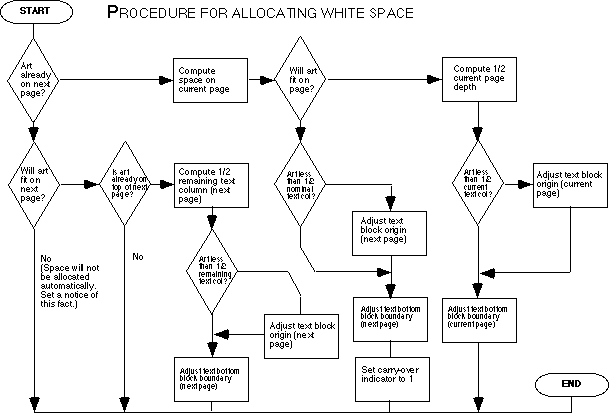
Though it appears in a book meant to teach students, it was not derived directly from design practice, but rather presents the procedure used by a specific automatic typesetting system. This system was no doubt generated by laborious programming and critique by professional designers. Furthermore, the procedure probably does not accurately represent what human designers do when making the same decision.
A human designer laying out a page by hand follows an iterative process of testing and critiquing. Because the machine does not currently have the perceptual and aesthetic intelligence necessary to see a trial design and critique it, the machine cannot perform page layout in the same manner as a person would. A designer would probably not explicitly ask him or herself all the questions in the diamonds in the flowchart before rendering a design: Will art fit on the next page? Is art less than half of the current text column?

Rather, a designer in an exploratory phase would generate a sketch or trial design, then simply look at the resulting design. The critiquing process notices such problems as a design element overflowing the page boundary as an instance of the general constraint of "getting things to fit", rather than a specific check on the placement of the individual design element. Backtracing the reasoning that led to the placement of the offending element results in suggesting a remedy for the problem, for example, to place the overflowing element on the next page. A designer eventually becomes experienced in the particular design problem, and learns not to generate trial designs that violate page boundary constraints in the first place. The iterative structure we expect of the human design process is not reflected in the "compiled" flowchart presented.
_______________________________________________
POEMS Name Tag: PM
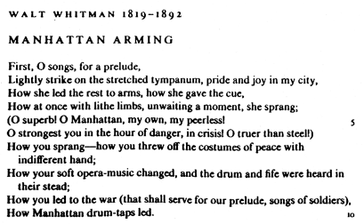
However, despite the faults of the written descriptions, the book is rescued from uselessness by examples on the pages following. The Walt Whitman poem "Manhattan Arming" is typeset using different styles to convey the permissible range of possible alternatives. Much information is contained in the examples which is not mentioned in the corresponding text, yet is nonetheless quite important. For example, the spacing between letters in the title of the second version of the poem is wider than that used for the first version of the poem. Since the significant difference between the two titles is their placement, the student should infer a causal connection between placement and spacing: Whenever you center a title as opposed to left-justifying it, increase the spacing between letters. Furthermore, to fully utilize this information in further examples, the student must be aware that the intent of the space increase is to augment the prominence of the title by making it occupy more horizontal space on the page. Thus the spacing increase should persist in the face of other irrelevant changes, such as if the title were set in lower case instead of all caps, but perhaps not if the title was so long that it overflowed a single line. This would cause the goal of increasing the horizontal space occupied by the line to fail. In order to properly learn the intent of the example, the student must essentially reconstruct the design reasoning process that led to the particular design choices made, and construct a "similar" set of design choices in each new design problem.

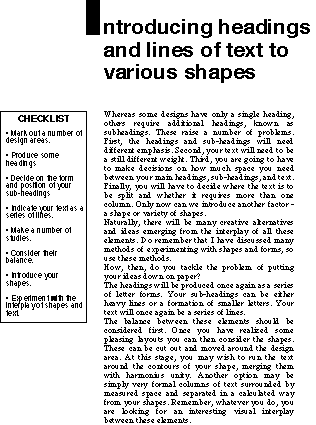
The title, "Introducing headings and lines of text to various shapes", is broad and lacks indication of purpose. The checklist, where one would expect a concise statement of the procedure being conveyed, is hopelessly general and vague. Advice such as "Produce some headings" or "Make a number of studies and consider their balance" can't be followed with success by the beginning student without further explanation of how to achieve those goals. Little or no explanation of heading production or balance judgment is given explicitly in the text.
However, the approach of this design book is to illustrate each mini-chapter with a selection of design sketches. A sketch differs from an example design mostly in the level of abstraction with which the student is intended to view the work; a sketch is abstracted with far less precision. Accompanying the article is a series of postage-stamp sized sketches delineating a space of design alternatives for a layout with one heading, one or more graphic forms, and a block of text.
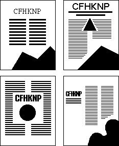
The series of sketches provides a rich and specific set of suggestions for accomplishing the goals and satisfying the constraints alluded to in the text. The content of the title and article are largely irrelevant, but the size, alignment and placing of forms are highly significant. There are alternatives with centered, left-, right-, and both-justified headings. Techniques for achieving balance are illustrated that visually emphasize the center with the large heading or illustrations, or matching an emphasis on one side of prominent size or attention-getting form with an equally important emphasis on the other.
Much knowledge is conveyed by the side-by-side presentation of alternatives. Showing several alternative designs can convey that one may make a choice between different heuristics for solving the particular design goal, or they may be intended to show how to abstract a generalized design that ignores irrelevant aspects while preserving essential ones.
Provided the student has made a substantially correct identification of the aspects of the sketches that should be abstracted, a student can learn an effective procedure for creating acceptable designs by "copying" the suggested examples. That is, given a specific design problem, substituting the heading, text, and illustration used in the problem for those in the design sketch should yield a design that satisfies the stated goal, such as balance.
Often, however, the process of utilizing knowledge contained in the design examples is more complex that simply slavishly using a previously created design as a template. True creativity in using previously acquired design knowledge often requires experimentation with variations that might involve different layers of abstraction, or combining knowledge from multiple examples. Thus, the process of using visually presented examples is more like making an analogy from the original example to each new design problem. The student must understand how the specific choices made for the example designs satisfy the goals of the design, so that he or she can construct "analogous" solutions for future problems. This involves identification of the salient features of each design solution, and the ability to ignore irrelevant aspects.
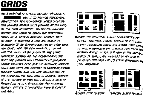
The grid idea is notable both because it is a powerful graphical concept in organizing layouts, and also that it is normally invisible in the finished design; it is not itself a graphical element of the design. The grid is therefore a more abstract concept than that of, say, a heading. It represents the importance of visual abstractions in design communication.
Despite the grid's invisibility in the finished design, the grid concept can, and in fact must be reified graphically by its relation to visible graphical elements in the design for the student to successfully learn the concept. As in all the design books, the text alone does not adequately communicate a procedure to the student in usable form, apart from the visual examples. However, here the text is much more effective, because the connections between the principles articulated in the text and their expression in graphical form are indicated explicitly. Very important is the ability to point to a graphical element, and caption it to indicate how it should be interpreted by the student. These indications direct the student's cognitive task of generalization explicitly, and increase the likelihood that the student will formulate the generalizations intended by the book's author. Again, we can see how multiple examples are used to suggest alternative heuristics for accomplishing a single design goal.
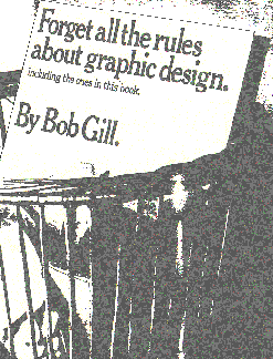
This use of form to convey content is amply illustrated in the delightful book, self-referentially titled Forget all the rules about graphic design (including the ones in this book) by Bob Gill. This book presents many examples showing how a designer can produce arresting illustrations that grab the viewer's attention to the message that the layout is trying to convey. The key is to tie the process of the viewer's visual interpretation of the image to the subject matter of the advertisement.
The effective technique conveyed by this book is to set up a visual image that is readily identifiable and creates visual expectations on the part of the viewer. Then, the expectations are violated in a way that attracts the user's attention as "wrong" or unusual. The differences between the presented and expected images are designed to associate in the mind of the viewer with the subject matter.
The cover of the book itself shows an image of a book sitting in a garbage can. The image is shocking in that the presence of the book in the trash implies a negative opinion of the book, which one would hardly expect the author to promote. This is further reinforced by the unconventional title. The reader is comforted when realizing that the intent is a promise to enlighten the reader to such an extent that he or she will not need to follow explicitly stated rules about design.
Original problem: Image for a book jacket on American Capitalism
Problem redefined: Make one image that says both America and Capitalism.

The American flag design, for example, sets up a strong expectation that the stripes of the flag will be straight, horizontal lines. The image is successful because it breaks that expectation, and brings in the image of a business graph [happily, on the rise] suggesting the connection between the two major topics of the book being illustrated.
This is very similar to how the principle of expectation violation is used in AI work on story understanding [Schank 85]. The first part of a story is devoted to setting up expectations. Whenever divergences from expectations generated by a standard "script" are noted, the attention of the problem solver is directed toward finding an explanation of the violation. These explanations are often good clues as to the intention of the author of the story. Schank's recent work [Schank and Childers 88] emphasizes the role of expectation violation in creativity, but does not explicitly treat the graphic design domain.
Interestingly, nowhere does the book's text explicitly state the expectation-violation theory of design, as I just did. However, the examples illustrate it so eloquently that all but the most dull of design students should be able to learn from it. Among all the design books I surveyed, this book was both the most successful in its ability to convey useful principles for creative design, and not coincidentally, had the fewest words.
Many areas of application for artificial intelligence are characterized by what Feigenbaum and others refer to as the knowledge acquisition bottleneck. This says that the major obstacle to successful application of AI techniques is not so much the representation of expert knowledge in the machine as the acquisition of the expert knowledge from the human experts. A study of design education indicates that the methodology for knowledge acquisition in visual domains will have to differ substantively from the methods commonly used in the "hard" sciences and engineering.
* Designers communicate expert knowledge graphically, not through text. Since graphic design is, above all, about graphics, this conclusion should not be surprising. But it has tremendous impact for the problem of knowledge acquisition, since almost all traditional expert systems techniques are based on textual communication. This largely renders much contemporary activity in AI, such as rule-based systems, logic programming languages, non-monotonic reasoning, etc. of little help to the problem of knowledge acquisition for design, since the designers cannot be reasonably expected to communicate their knowledge in a form acceptable as input to these systems.
Luckily however, graphic designers have already begun to embrace computer assisted illustration and layout systems as part of their everyday work. These systems, though they do not typically represent design knowledge beyond remembering the coordinates and shapes of graphical elements placed manually by the designer, do record graphical input of visual examples. I strongly believe that the only practical way to build knowledge acquisition systems for design is for the designer to communicate directly with the system through the graphical interface itself.
The challenge now remains to move beyond the simple graphical manipulation of images performed by such systems, to recording the designer's intent in symbolic and general form. Fortunately, it is not necessary to solve the problems of machine vision and pattern matching to make use of the knowledge embedded in graphical examples in knowledge acquisition. The designer must be provided with the means to construct explanations of the graphical examples, indicating which aspects of the design are to be taken as salient, and demonstrating dimensions along which the examples may be generalized.
* Communication of design knowledge should be example based. Most knowledge representation systems work from the general towards the specific. The systems take as input knowledge in a general form: rules, frames, or logical assertions. They can then use an inference engine to apply knowledge in specific examples. Our observation of designers indicates the opposite: designers typically start with specific example designs that are in a concrete form. They then use these as the means to communicate more general knowledge that can be applied, using a process of analogy, to future designs.
The approach we take, then, is that expert systems from graphic design must learn by example. We have been investigating the technique of programming by example, [Lieberman 92, 93] as a means for embedding a machine learning engine in a graphical interface framework.
By applying the techniques of recording gestural actions of a designer using an interactive graphical interface, supported by symbolic learning procedures which allow the designer to communicate by using concrete visual examples, we believe the prospects are good for building knowledge acquisition systems for graphic design. We would like to enable an expert designer to communicate design knowledge to a computer in the same manner as he or she would teach a novice design student. We believe that this will be an important step on the road to intelligent systems for graphic design.
This work was supported by grants from Alenia, Apple Computer, ARPA/JNIDS, the National Science Foundation, and other sponsors of the MIT Media Laboratory.
Allen Cypher, ed. Watch What I Do: Programming by Demonstration, MIT Press, 1993.
Bob Gill, Forget all the Rules about Graphic Design (including the ones in this book)
Henry Lieberman, Bringing Programming to Visual Thinkers, in [Cypher ed., 93].
Henry Lieberman, Graphical Annotation as a Visual Language for Specifying Generalization Relations, IEEE Symposium on Visual Languages, Bergen, Norway, August 1993.
Henry Lieberman, Capturing Design Expertise by Example, in East-West Conference on Human-Computer Interaction, St. Petersburg, Russia, August 1992.
Henry Lieberman, Towards Intelligent Applications in Graphic Design, Fifth Generation Computer Systems Conference, Tokyo, 1988.
Stanley Rice, The Making of Pages, R. R. Bowker Co.
Stanley Rice, Book Design: Systematic Aspects, R. R. Bowker Co.
Roger Schank and R. Abelson, Scripts, Plans, Goals and Understanding, Lawrence Erlbaum Associates, 1985.
Roger Schank and Peter Childers, The Creative Attitude, Macmillan, 1988.
Alan Swann, How to Understand and Use Design and Layout, North Light Books, Cincinnati, Ohio, 1987.
Louis Weitzman and Kent Wittenburg, Relational Grammars for Interactive Design, 1993 IEEE Workshop on Visual Languages, Bergen, Norway.
Jan White, Graphic Design for the Electronic Age, Xerox Press/Watson-Guptil, 1986.
.