ASCII Graphics in Postscript
May 13, 1999
Abstract
In Spring 1999 I took a course with Mike Bove, "Digital Image
Processing for Hard Copy" (MAS 814). For a final project I worked on
making nice ASCII graphics, by thinking of letters as a form of
halftoning. I started with AA-lib, an excellent ASCII graphics
renderer. I went through and understood its algorithms, documented
them, fixed a few bugs in their model of Courier, and then augmented
AA-lib with a special postscript output that uses bright and dim
characters to increase dynamic range.
I have placed my code and my results online.
Unfortunately, the images I produced are not directly web-visible;
you have to download postscript programs and send them to your printer. An on-screen postscript interpreter is not good enough, you need high resolution.
ASCII graphics
ASCII graphics are fun. Now that most everyone has access to bitmapped
displays and fancy printers there's not much need for reproducing art
as characters. But I still like the æsthetic of ASCII art, the
coarse retro feel.
There are some excellent archives of ASCII art online, such as Christopher Johnson's
ASCII Art Collection. Yahoo has an
index. I've prepared
a few samples that I particularly like.
ASCII art falls into two categories - line art and fill art. All
the best ASCII art is drawn by hand; it's hard to automate.
But a good program can
produce fairly good fill ASCII art.
AA-lib, an ASCII graphics
renderer, is the best package I know of for doing this. See in
particular the BB Demo for
what animated ASCII graphics can do. My project was to improve AA lib,
in particular to give it a special Postscript output option to let
people make better printed ASCII art.
Original images
Most of my experiments were with two images. One is "Hive", a
picture of myself and a group of folks I work with, photo copyright
Webb Chappell. You can see the original image as portable greymap or compressed postscript. The other is
"Circle", a radial gradient from 0.0 gray to 1.0 gray (pgm or ps). Finally, I did a final test with
the standard Lena image (pgm).
pbmtoascii
In the old days, the best tool for ASCII graphics was pbmtoascii.
This takes a bitmap and converts it into ASCII by examing groups of
1x2 or 2x4 pixels and translating them to a character. For 1x2 pixels,
there are four characters possible: a blank, ", o,
or M. The results aren't very good. The 2x4 map is more
complex, but still looks pretty bad. The actual characters chosen
aren't optimal and the restriction of input to a bitmap limits what
can be done.
Here are a few examples of the results of pbmtoascii. Note, these
are rendered in very small fonts (Courier 3pt or so). A postscript
previewer on screen will not do this justice, you need to print them
out to really see what's going on.
- Hive, Floyd-Steinberg
dithered, 1x2 mask
- Hive, Floyd-Steinberg
dithered, 2x4 mask
- Circle, Floyd-Steinberg
dithered, 2x4 mask
- Circle, Bayer dithered,
2x4 mask (fixes F-S noise).
- Hive, clustered-dot
dithered, 2x4 mask (amusing effect).
AA-lib
AA-lib is a much better
way to do things. AA-lib works on greyscale input and has a quite
sophisticated model of how to convert to characters. The basic idea is
to consider ASCII characters as a very funny kind of halftoning, where
you want to minimize the error between the original image and the
ASCII substitute. A special aspect is that letters don't just have
some intensity, they also have a distinctive shape. AA-lib has a nice
mechanism for trying to match shapes so that contours are preserved.
(The contouring is quite visible in the circle images I tested.)
The only problem is that AA-Lib is 6000 lines of dense, uncommented
code. I went through the software and figured it out, here's a sketch
of their algorithm:
AA-Lib Algorithm Overview
- Draw on a frame buffer, render to text
- 2x2 blocks of pixels evaluated and matched to text
- Closest character is substituted
- Floyd-Steinberg propagation of error
- Multiple devices: linux console, X11, stdout, etc
- Multiple display options - dim, bright, bold, reverse
- Multiple glyphs - ASCII, ISO-Latin-1, graphics chars, etc
- Multiple fonts - console, X11, courier, etc
- Brightness, contrast, gamma correction
- Floyd-Steinberg, error distribution, white noise dithering
Pixel Matching
- 2x2 blocks of pixels selected
- Top 4 bits of each pixel are taken -> 16 bits per cell
- Image adjustment (brightness, contrast, gamma)
- If all 4 pixels are about the same, select character from fill table
- If 4 are significantly different, select character from shape table
- Floyd-Steinberg propagate the error
Halftone model
- Halftone table is generated first (2^16 entries!)
- Bitmap of the font (8x12 or so) is stored in program
- Calculate brightness of the 4 corners of the font and total brightness
- Adjust brightness based on dim/bright/reverse/boldfont
- Match function: 2^(x-y) for each of 5 components, weight corners or middle
- Fill table - for each grey, select best match char
Each corner and the whole value should match the gray
- Shape table
- First, for each character, put it in the best place
- Then, for each 2^16 possibilities, find char that is the best match.
Each corner of char should match the corner of position,
plus whole value.
AA-Lib to Convert to Text
AA-Lib can be used as a replacment for pbmtoascii (making
pgmtoascii). Getting the aspect ratio right this way is tricky, since
characters aren't square. I scaled most things vertically by 66%, that
should be about right. The results are much better than pbmtoascii,
especially using Courier-Bold to make everything darker:
AA-Lib to Convert to Postscript
AA-Lib has a very clever feature (inspired by the old PC monochrome
text model). Letters don't have to have one intensity - they can be
displayed dim or bold. Obviously, with straight text output you can't
simulate this. But with postscript output, you can! To take advantage
of this, I wrote a postscript output driver for AA-lib (you can get the code below).
I looked at various strategies for simulating "bright" and "dim" in
postscript. The most obvious option is to use Courier-Bold instead of
Courier for "bright" characters. That works but feels a bit like
cheating, and the range isn't very good. A better option is to draw
the string, but then to also draw the outline of the characters with a
very thin line. The code is like this:
/B { dup gsave false charpath 0.05 setlinewidth stroke grestore show } bind def
The results are a bit unpredictable. A line of width 0.05pt is very small (1/1440 of an inch), below the
rasterizing capability of most printers. Worse, the "charpath" of an
font doesn't follow the nice Type 1 hinting that the "show" of a font
does. But it happens to look good for
my printer, especially at small sizes like Courier 3pt.
I also tried simulating overstrike by printing the character near
to on top of itself
/B { dup gsave -0.04 0 rmoveto show grestore 0.04 0 rmoveto show -0.04 0 rmoveto } bind def
But that didn't work very well - it is also unpredictable, but in this
case wasn't much darker and led to some odd banding.
The obvious thing to try for dim is the opposite of bold: show the
character, then draw the outline in white on top.
/D { dup dup gsave gsave show grestore 1 setgray false charpath 0.05 setlinewidth stroke 0 setgray grestore stringwidth rmoveto } bind def
This works OK, but makes the characters look a bit broken. It's also
quite slow for the printer (as is the charpath bold). One can just
fill the character with a light grey:
/D { 0.75 setgray show 0 setgray } bind def
This looks quite good, but feels like cheating.
Personally, I like the charpath solutions best, since they are the
most "pure". Multiple Master fonts are really the right way to do this
kind of thing, since they have code to say things like "draw this
font, only heavier".
Font Model
AA-Lib does its magic by calculating a table of substitutions based
on a bitmap model of the font. If you look at the best circle output,
you see that the tone scale is not very uniform - there are obvious
bands where things are too light or dark. By tweaking the font model,
I fixed these problems.
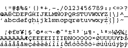
|
When I extracted the original font table
(at right), I discovered a bad off-by-one bug in the courier model
that comes with AA-lib. The problem is quite visible in the single
pixels below 'h' and 'i' - one pixel from the next character to the
right has been carried over! Fixing that problem, the results of
AA-lib are much nicer.
|
 |
|
Fixing this problem in the font model, AA-lib does much better. However,
the circle still shows some tone scale problems; AA-lib thought that some
characters were darker than they really were, or lighter. To fix this,
I went in and hacked the font table by hand. I changed the models of
'c', 'K', 'w', 'g', 'o', and 'x', and removed '4' entirely (because I
couldn't fix it). The corrected table is at right, and the results,
particularly on the circle, are quite clear.
|  |
Putting it All Together
Putting all these improvements together: the use of AA-lib, the use
of bold/dim, and the font table fixes, the result is quite impressive.
These demonstrations are on the classic Lena
image. The AA-lib version really looks like a person!
Future Ideas
AA-Lib isn't just restricted to ASCII: ISO-Latin-1 and graphic
control characters can also be used. And with my code, any
postscript font can be used. I wanted to do a Cyrillic-graphics
version of this work, but figuring out how to make postscript use a
Cyrillic font defeated me. (There are some good free
Cyrillic Courier fonts online). Doing ASCII graphics with a
proportional font would be lots of fun, although it would make the
encoding process quite tricky. Finally, there's some room for entropy
in the font table - several characters are often a good match. These
extra bits could be used for æsthetic purposes, or to stuff some
data into the ASCII image.
The Code
I wrote a program that can read in PNM images and write out
postscript files, with the full suite of AA-lib options. If you set the
environment variable AAMODE to 0, it'll also write out plain text.
Feel free to play with my code. It's a hack, not polished or
particularly well explained, but it worked well enough for me. If you
do something interesting with it, please let me know. I'll help
someone if they want to clean this up and release it as an add-on for
AA-lib and/or netpbm.
- pgmtopstext.c, the main C program.
- fontcourierdata.h, a bitmap
model of the courier font. Slightly tweaked from AA-lib's, read
above for details.
- showfont.c reads fontcourierdata.h and
dumps it out as a PBM. Useful for looking at your font model.
- A makefile to compile pgmtopstext - trivial.