Ron Baecker, Chris DiGiano, and Aaron Marcus
For a CACM Special Issue on Debugging and Software Visualization
Software visualization is the systematic and imaginative use of the technology of interactive computer graphics, and the disciplines of graphic design, typography, colour, cinematography, animation, and sound design, to enhance the comprehension of algorithms and computer programs (Price, Baecker, and Small, 1993; Stasko, Domingue, Brown, and Price, 1997). This article will demonstrate that graphical and auditory representations of programs[1] are useful in debugging and also enliven and enrich programming as a cognitively accessible multimedia experience.
To illustrate these ideas, we present three visualization approaches we have developed. They demonstrate the richness of software visualization media and portray design tradeoffs inherent in their use.
The first example, a 30-minute film teaching nine sorting algorithms, demonstrates the power of algorithm animation. We then present the results of research on the design and typesetting of computer program source text to enhance its readability. The final approach is represented by our LogoMedia programming environment for the interactive construction of visualizations during program creation and debugging.
Algorithm Animation: How Does the Program Work?
Animation is a compelling medium for the display of program behaviour. Programs execute through time, so they can be vividly represented by animation which portrays how they carry out their processing and how their essential state changes over time. A program's state is determined by its data, so one way to portray the program is to show the data transforming over time. By viewing these transformations, or several sequences resulting from different sets of initial data, we can perceive structure and causality, and ultimately infer why and how the program is working or not working.
Software visualization can therefore be a powerful tool for presenting algorithms and programs and assisting programmers and students as they struggle to debug them. Yet animating algorithms is not a trivial endeavor. To be effective, algorithm animation must abstract or highlight only those aspects of a program that are essential at the moment. Visualizations must enhance relevant features and suppress extraneous detail; employ clear, uncluttered, and attractive graphic design; and use appropriate timing and pacing.
We decided first to demonstrate the power of this idea by producing a 30-minute colour sound teaching film, Sorting Out Sorting (SOS) (Baecker, 1981, 1997). SOS uses animation of program data and an explanatory narrative to teach nine internal sorting methods. The movie has been used successfully with computer science students at the university and high school level. A student who has watched the animation carefully can program the methods herself, and will understand the concept of efficiency differences between n2 algorithms and those whose execution time is proportional to n log n.
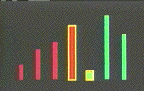
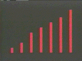
Assume, for example, that we wish to sort an array of numbers. We can portray each datum as a vertical bar (Figure 1), whose height is proportional to the item's value. Initially, the heights of adjacent items will vary upwards and downwards. Successive steps produce rearrangements of the data, until ultimately the elements are arrayed left to right in order of increasing height.
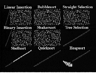
The film deals with three insertion sorts, three exchange sorts, and three selection sorts. It begins with the insertion sorts, in which successive items of data are inserted into their correct position relative to items previously considered. The movie introduces Linear Insertion (Figure 1), the simplest of the insertion sorts, Binary Insertion, and Shellsort (Figure 2). Exchange sorts interchange pairs of items until the data is sorted. The film demonstrates two n2 exchange methods, Bubblesort and Shakersort, and one n log n method, Quicksort (Figure 3). Selection sorts are those which the algorithm selects one item in turn and positions it in the correct final position. The movie presents three such methods -- Straight Selection, Tree Selection, and Heapsort.
Animation Design Challenges
A problem in early drafts of the film was a lack of consistent visual conventions. Viewers should be able to forget about the technique of presentation and concentrate instead on what is being taught. Without an appropriate set of visual conventions, such as one colour to denote "sorted" items and another for "items still to be considered," one may spend more energy trying to figure out what the picture means than she will expend in trying to follow the algorithm.
Another central problem is that of timing. The steps of the algorithms must first be presented slowly, to give time both for the narrator to explain what is happening and for the student to absorb it. However, once the algorithm is understood, later steps may be boring.
We needed a visually interesting and convincing way to convey the concept of efficiency. We can use animated performance statistics, but if we wish to show the algorithms operating upon large amounts of data, we have new representation problems. To fit the desired information legibly onto the screen and to compress the animation into a reasonable span of time require the design of new methods of portraying the data and illustrating the algorithm's progress.
More generally, we are faced, throughout the film, with the problem that totally literal and consistent presentations can be boring. Yet consistency is required so that changes made for visual purposes not be interpreted falsely as clues to understanding the algorithm. Being literal and explaining things step-by-step is required to aid initial understanding, but we must also go beyond this to add dramatic interest as we present more advanced material.
Design Solutions
The presentation of nine algorithms, grouped into three groups of three, lends itself to a pleasing symmetry. Within each group, we adopt a different set of visual cues, while retaining the same underlying conventions. Thus, in each group, one colour is used to indicate items "yet to be considered"; a second colour denotes those items which are "already sorted"; and a third is used to form borders around items which are currently being compared. Whenever items are dimmed and faded into the background, they are "not currently being considered" within the context of the algorithm.
Only the data appears on the screen. There are no pointers, no labels, and no gimmicks. Attributes of the data and the algorithm are conveyed entirely by the visual clues described above, by the motion of the data, by the accompanying narrative, and to a lesser extent by the music track, which is not directly driven by the data but conveys the feeling of what is going on. Where necessary, the pace of the sort is decreased to allow time for complex narration and for the viewers to digest what is going on. The pace is sometimes increased to avoid boredom after the initial explanatory passes.
After all three algorithms of each class have been presented, we illustrate their efficiency with line graphs showing numbers of data comparisons and movements and total execution time for sorts of n items, where n ranges from 10 to 500. The three graphs distinguish clearly the n log n from the n2 algorithms.
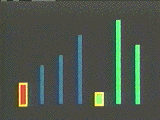
To illustrate this even more dramatically, we then run a "race" of all three techniques simultaneously on the screen, sorting 250 items of data. Each algorithm is accompanied by a digital clock measuring film time, which stops as soon as the data is sorted (Fig. 3). Each algorithm's title appears as soon as its data is sorted. The slowest algorithms take over two minutes, while the n log n sorts are finished in five to fifteen seconds.
We close with a "grand race" of all nine algorithms, sorting 2500 items of data each (Fig. 4). Each item of data is represented by a coloured dot. The value of the item is represented by its vertical location, its position in the array by its horizontal location. Unsorted data appears a cloud, sorted data as a diagonal line.
Tree Selection and Quicksort finish in 20 seconds each; the other n log n algorithms within another 20. Their sorted data then fades out while the n2 sorts plod along during the final credits and then also fade out. This happens long before they are finished, since it would take another 54 minutes for Bubblesort to complete.
The grand race also illuminates the algorithms. We see how Shellsort moves all the data close to its final position, then finishes the job on the final pass. We see the recursive behaviour of Quicksort as it picks up rectangular regions of the array and squashes them into a line. We see the peculiar way in which Heapsort organizes and shapes the data into a funnel as it picks off successive largest remaining elements.
The Epilogue provides an opportunity for review by replaying the entire film at 12 times normal speed, thereby also generating visual patterns unique to each method that are not obvious at normal speed.
The film goes beyond a step-by-step presentation of the algorithms, communicating an understanding of them as dynamic processes. We can see the programs in process, running. We therefore see the algorithms in new and unexpected ways. We see sorting waves ripple through the data. We see data reorganize itself as if it had a life of its own. These views produce new understandings which are difficult to express in words.
Sorting Out Sorting has been successful and influential. More than 600 copies have been sold over the past 15 years, mostly by word-of-mouth. It encapsulates in 30 minutes of animation the essence of what written treatments require 30 or more detailed pages to convey. Interviews with students and an informal, unpublished experiment make it clear that the film communicates effectively both the substance of the algorithms and the concept of their relative efficiency.
The film was also instrumental in stimulating further work in algorithm animation, most notably that of Marc Brown (1988), which together with SOS in turn inspired much of the work in the field. The project also taught us many lessons about algorithm animation, most importantly:
Figure 2a-b. Shellsort. Shellsort begins by performing insertion sorts on subsequences of the data spaced widely apart, moving items closer to their ultimate destination relatively quickly. It then performs insertion sorts on subsequences of the data spaced more closely together. It continues in this way until it finally performs a Linear Insertion Sort as the final pass. Because items are already close to where they belong, this is now very efficient. The two frames show the beginning and end states of the 1st pass, which performs an insertion sort on a subsequence of the data consisting of every 5th item.
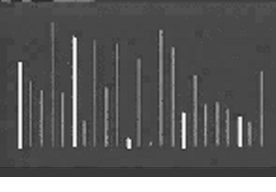
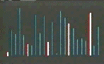
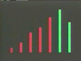
Figure 3a-d. The race of the three Exchange Sorts. a) The Quicksort completes after roughly 7 seconds. b) It takes over 1 minute 40 seconds for the Shakersort to approach completion. c) At 2 minute 21 seconds, Shakersort completes. d) The Bubblesort finally completes at just over 2 minutes 45 seconds. Notice that Bubblesort works from the top down, while Shakersort works from both the top and the bottom.
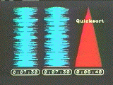
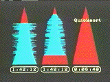
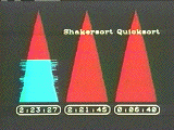
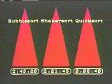
Figure 4a-b. Sorting Out Sorting's "grand race." Unsorted data appears as a cloud; sorted data becomes a diagonal line. The difference between the n log n sorts (Shellsort, Quicksort, Treesort, and Heapsort) and the n2 sorts are clearly visible. Notice Shellsort's pushing of the data towards the line, Quicksort's recursive subdivisions, and Heapsort's strange data funnel.

 Source
Code Presentation: How Should It Look?
Source
Code Presentation: How Should It Look?
To debug a program, one must also view and think about source code from different perspectives. We therefore developed techniques for enhancing source code readability and comprehensibility (Baecker and Marcus, 1990, 1997).
Program appearance has changed little since the first high-level languages were developed in the 1960s. Unlike symbolic systems such as circuits, maps, mathematics, and music, we lack sophisticated notations and conventions employing the tools of design and typography such as typefaces, weights, point sizes, linespacing, rules, gray scale, diagrams, and pictures. Knuth (1984, p. 97) expressed the challenge eloquently:
"I believe that the time is ripe for significantly better documentation of programs, and that we can best achieve this by considering programs to be works of literature. Hence, my title: 'Literate Programming..... Let us change our traditional attitude to the construction of programs: Instead of imagining that our main task is to instruct a computer what to do, let us concentrate rather on explain-ing to human beings what we want a computer to do."
Our work has sought to demonstrate and explain (as does Oman, 1997) how communication about and comprehension of programs can be aided by improving the visual schema and appearance of programs.
To illustrate, Figure 5 is the first of two pages of a typical short C program that prints an alphabetic equivalent of a numerical phone number.[2] We explain our design's salient features with reference numbers, e.g., (1) and (17), that refer to the small numbers in circles in the right margin of the program page.
At first glance, it may seem that we are talking only about "prettyprinting," but this goes significantly beyond prettyprinting in several ways:
* Rich typographic representations with many degrees of freedom change the
problem to one that is qualitatively different from that of conventional
prettyprinting.
* We identified graphic design principles for software visualization
and applied them to programming languages.
* We systematically carried out experimental variations in an
iterative graphic design process to derive design guidelines and recommended
conventions for program appearance.
* We formalized these guidelines and specifications in a graphic design
manual for C program appearance.
* We developed a flexible experimental tool, the SEE visual
compiler, which automated the production of enhanced C source text. SEE
was highly parametric, allowing easy experimentation with novel variations to
suit the style preferences of programmers.
* Finally, we enlarged our scope from the narrow issue of formatting source
code to a broader concern with programs as technical publications. In
doing so, we considered the entire context in which code is used, a context
which includes the supporting texts and notations that make a program a living
piece of written communication. We developed proposals for designing,
typesetting, printing, and publishing program books, integrated bodies
of program text and metatext, and incorporating displays of essential program
structure, called program views, designed to help programmers master
software complexity.
Program books are needed because typical source text does not itself have sufficient communicative depth. A large real program is an information narrative in which the components should be arranged in a logical, easy-to-find, easy-to-read, and easy-to-remember sequence. The reader should be able quickly to find a table of contents to the document, to determine its parts, to identify desired sections, and to find their locations. Within the source text, the overall structure and appearance of the page should furnish clues regarding the nature of the contents. For example, headers and footnotes should reinforce the structure and sequencing of the document.
To illustrate these concepts, Figure 6 consists of eight miniature pages from a prototype program book (see also Oman and Cook, 1990a,b) based on Henry Spencer's implementation of Joe Weizenbaum's Eliza program.
In developing the concept of the program book, we applied the visible language skills of graphic design, guided by the metaphors and precedents of literature, printing, and publishing, to demonstrate that program text should and can be made perceptually and cognitively more accessible and usable. Future generations of students and programmers should be able to read the great works of programming literature, such as a UNIX kernel, a Logo interpreter, and a program by Knuth, all typeset in beautiful editions and accessible in a student's physical or virtual bookshelf.
Enhanced program presentation produces listings that facilitate the reading, comprehension, and debugging of computer programs. Baecker and Marcus (1990) and Oman and Cook (1990a,b) present both theory and experiments[3] suggesting the following: Making the interface to a program's source code and documentation intelligible, communicative, and attractive will ultimately lead to significant productivity gains.
Figure 5. Page 1 of a designed and typeset program. (Baecker and Marcus, 1990, p. 9).
The program is output on loose-leaf 8.5" X 11" pages, each separated into four regions, a header (1), a footnote area (17), a main text column for the code and most comments (3, right), and a marginalia comment column (3, left). Each file appears as a separate "chapter" with the filename shown as a large, bold title (2). Extra white space provides adequate separation between the prologue comments (see below) and the code (5), between function definitions and declarations (10), between individual function definitions, and between the header and body of a function definition (14). Cross-references relating uses of global variables to the location of their definitions appear as footnotes to the source text (17).
Each file may include, at or near its beginning, a prologue comment describing the module's purpose (4), which is displayed in a serif font over a light gray tone. Marginalia comments located on the same lines as source code are displayed in a small-sized serif font in the left column (9, left).
The introductory text of a function definition -- the function name -- is shown as a "headline," in a large sans-serif type (11). A heavy rule appears under the introductory text of a function definition (12). A light rule appears under the declaration of the formal parameters (13).
Identifiers being declared are aligned to an implied vertical line located at an appropriate horizontal tab position (7). Initializers are displayed at reasonable tab positions; programmer carriage returns are respected as requests for "new lines" (8).
Systematic syntax-directed indentation and placement of key words is employed (15). Since curly braces are redundant with systematic indentation, the user may have them suppressed, as shown here (15). In conventional program listings, it is impossible without turning the page to tell where a particular control construct (in this case, the for) continues on the following page. Our solution is an ellipsis, in line with the for, signifying that the first statement on the next page is at the same nesting level as the for (16).
Figure 6a-h. 8 miniatures of pages from a C program book (Baecker and Marcus, 1990, pp. 147, 151-4, 170, 177, 217).
a) is the book's cover page, including the title, list of authors, and an illustration.
b) is the abstract and program history page, summarizing its function and the history of its development.
c) is the authors and personalities page, introducing key individuals in the program's development and maintenance.
d) is one of the table of contents pages, describing the top-level structure of the book.
e) is one of two table of contents pages describing the program text, in which each file appears as a separate chapter.
f) is one of a set of program overviews, a program map consisting of condensations of all text pages. At normal size, one can see features of the code which assist in orientation.
g) is the second page of the program source text, typeset and printed according to the C design guide.
h) is the first of a set of indices, this one listing every called procedure and the name and location of each of its callers.
Interactive Visualization for Debugging:
How Does a Program Sound?
For program presentations to be useful in debugging, they cannot always be "canned" by visualization designers, but must be constructed opportunistically by software developers. To demonstrate the easy interactive specification of custom presentations, we developed a programming environment called LogoMedia (DiGiano, 1992; DiGiano and Baecker, 1992).
LogoMedia facilitates the visualization of programs with sounds as well as images. Connected to a MIDI synthesizer, it can be used to orchestrate acoustic feedback (Kramer, 1994) that informs programmers of key control and data flow events. Auralization has been used in software visualization (e.g., Brown and Hershberger, 1991) to augment, enhance, or replace graphical or textual portrayals for several reasons:
Audio Probes
Auralizations in LogoMedia are specified via "probes" that programmers can attach unobtrusively to their source code, i.e., without modifying the code. Programmers can configure or design probes to turn on synthesized musical instruments, play back sound samples, or make adjustments to a sound's pitch or volume. LogoMedia supports two types of probes: control probes for monitoring execution flow, and data probes for tracking variable values. The system provides a graphical interface for associating sound with Logo code and variables.
Programmers install control probes by selecting expressions they wish to monitor in one of LogoMedia's code windows (Figure 7) and then choosing probes from a pop-up menu at the top of window. These are designed by selecting from various auralization commands and MIDI instruments. In addition to the audio probe, LogoMedia offers other probes types which provide a consistent interface for creating graphical feedback as well audio. These include graphics probes for assisting in animation, text probes for printing tracing messages, and "generic" probes which allow users to execute their own Logo expressions for generating completely customized visualizations. Three examples of audio probes are shown in Figure 7.
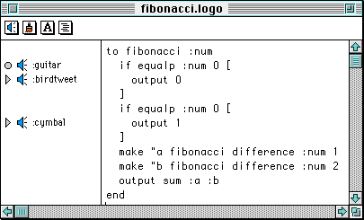
Figure 7. A LogoMedia code window containing a buggy fibonacci proceduree and three audio control probes. At the top of the window are the pop-up menu icons for LogoMedia's four probe types. The three probes appear on the left associated with the lines in the fibonacci procedure[4] that they are monitoring. For example, the two symbols and the word ":guitar" denote that a guitar note is associated with each call to the fibonacci. Here the programmer is using the default control probe action which is to play a note mapped to the depth of recursion. The other two control probes in the figure play unmapped sounds when execution reaches the first and second output statements. When fibonacci is run, the programmer hears a rapid series of guitar notes of increasing pitch as the program calls itself recursively on decreasing values of num. Then, a bird tweet is heard indicating the argument for one of the calls has reached 0. Because of a bug in the procedure, the guitar notes continue playing indefinitely without the cymbal sounding.
To investigate the bug, the programmer could use data probes, entering arbitrary Logo expressions as "triggers" for audio feedback. within a Probe Sheet window (Figure 8). Probes can then be linked to the triggering expressions using pop-up menus. Just like control probes, data probes can generate MIDI notes and/or adjust properties of sounds already being played. These actions occur whenever a probe's triggering expression is modified. Figure 8 illustrates two audio data probes for monitoring variables in fibonacci.
User Evaluation of LogoMedia
An observational ethnographic study was conducted to observe how programmers could make use of sound while coding and debugging and to gain feedback on LogoMedia's interface for specifying auralizations. Three subjects, with modest Logo or Lisp programming experience and varied musical background, each participated in a series of three sessions, each session lasting approximately two hours. The first session was a review of basic Logo programming constructs and an introduction to LogoMedia's audio probes. In the second session, subjects composed procedures for simulating the Game of Life and used sound to help evaluate their code. Finally, in the third session, subjects were asked to fix a different implementation of Life and were encouraged to use auditory feedback for debugging purposes. A think-aloud protocol was used to elicit comments from subjects as they worked.

We were particularly interested in how subjects would use sound in their "test runs," that is, Logo evaluations that checked for bugs or tested a theory. On average, they conducted 43 such test runs per session; in 55% of these, they used auditory feedback. Without explicit suggestions from the experimenter, they developed a variety of interesting ways to extract information from these test runs. Subjects generated audio feedback via control and data probes in order to complement visual feedback, identify errors in the code, and verify their bug fixes. They chose "iconic" sounds such as an explosion and a bell to denote important events such as the birth or death of a game piece. More musical sounds such as the piano were used to indicated on-going events such as the traversal of the simulation game board.
Audio control probes were used heavily by subjects to test whether execution reached a certain part of their code and to help answer other fine-grained flow control questions. To assess the values of variables at particular points in programs, they installed audio control probes at these points which mapped characteristics of the data to pitch, and used audio data probes to monitor changes to variables by mapping their values to sound. Trends were evident when these changes occurred rapidly in some patterned way. Subjects also used data probes to monitor acoustically variables such as loop indices, lists, and counters (e.g. for the numbers of neighboring pieces in a region of Life's board.)
While listening to their program execute, subjects took advantage of their unburdened visual processing abilities to manipulate the graphical interface. Listening activities included scrolling through code, manipulating windows, and adjusting the audio portrayal.
Just as the timing of visualizations was important for students learning from SOS, so was the speed of auralizations critical for subjects trying to make sense of acoustic feedback. Typically, they would create audio probes, run a program, adjust the speed of execution using LogoMedia's speed controller, and then run it again. Full execution speed seemed suitable for noticing general trends, as when subjects were tracking down infinite loops and wanted to know which procedures were running for too long. However, when the relative pitch was more important, subjects tended to slow execution by a factor of two or more in order to hear more carefully changes from one value to the next. One individual seemed to consider execution speed very important; on average he adjusted the speed controller once every four test runs in the final two-hour session.
Subjects, on their own initiative, began developing an acoustic vocabulary for describing their running programs. For example, one talked about a loop in his program "clicking." Another individual, when describing a procedure he just fixed for calculating the next generation in Life, commented that it "sounds like it's counting right now."
Subjects encountered a few problems with LogoMedia's auralization facilities. For example, they sometimes wanted to track the data flow in the program, but because of the functional nature of Logo, the datum they wished to monitor was not represented by a variable and could not be entered in the Probe Sheet. They got around this limitation by assigning the results of Logo expressions to temporary variables.
Another problem for subjects was avoiding cacophony. They complained that certain simultaneous sounds such as the piano and guitar tended to merge into one. Even when more distinctive sounds were used (such as the piano and the explosion), too many audio probes tended to cause confusion. Future versions of LogoMedia should allow users temporarily to disable probes to reduce noise. Subjects suggested that LogoMedia offer more specific domain-oriented sounds, and allow them to play back their own voice.
Because there were only three subjects, our results are suggestive rather than definitive. Yet several incidents suggest that the audio feedback was more than a novelty for users. For example, after identifying the missing loop index incrementer in Life one subject commented,
"That was neat. That was very helpful. I think, if I hadn't had the sound, I would still be banging away at this."
More subtle, but perhaps more convincing evidence can be seen in how all three subjects reacted to system failures which caused their audio probes to be lost. This happened five times during the study, at least once to each subject. In four cases the individuals elected within five minutes of LogoMedia being restarted to reinstall the probes almost identically to the way they were before the failure. This was done without prompting from the experimenter or the written instructions.
Conclusions
We have presented three software visualization approaches useful for debugging. We began with carefully crafted algorithm animations of how programs work, then discussed enhanced typographic representations of how source code should look, and concluded with an interactive environment for letting programmers specify software visualizations including hearing how the programs sound.
We can derive several implications for the design of debugging technology from our work:
Acknowledgments
Many individuals, all acknowledged in Baecker (1997), Baecker and Marcus (1990), and DiGiano (1992), contributed to this research. We are especially grateful to Michael Arent, Ilona Posner, Hugh Redelmeier, Alan J Rosenthal, and David Sherman, and to the Advanced Research Projects Agency (U.S.) and to the Natural Sciences and Engineering Research Council (Canada) for financial support.
References
Baecker, R.M., with the assistance of Dave Sherman (1981). Sorting out Sorting, colour sound film, University of Toronto. (Distributed by Morgan Kaufmann.)
Baecker, R.M. (1997). Sorting Out Sorting: A Case Study of Software Visualization for Teaching Computer Science. In Stasko, J., et al., op. cit.
Baecker, R.M. and Marcus, A. (1990). Human Factors and Typography for More Readable Programs, ACM Press, Addison-Wesley.
Baecker, R.M. and Marcus, A. (1997). Printing and Publishing C Programs. In Stasko, J., et al., op. cit.
Brown, M.H. (1988). Algorithm Animation. MIT Press.
Brown, M. H., and Hershberger, J. (1991). Color and Sound in Algorithm Animation. IEEE Computer, 25(12), 52-63.
DiGiano, C. J. (1992a). Visualizing Program Behavior Using Non-Speech Audio. M. Sc. Thesis, University of Toronto.
DiGiano, C. J. and Baecker, R. M. (1992b). Program Auralization: Sound Enhancements to the Programming Environment. Proc. Graphics Interface '92. Morgan Kaufmann, 44-52.
Kramer, G. (Ed.) (1994). Auditory Display: Sonification, Audification, and Auditory Interfaces. Addison-Wesley.
Knuth, D.E. (1984). Literate Programming. The Computer Journal 27(2), 97-111.
Marcus, A. (1992). Graphic Design for Electronic Documents and User Interfaces, ACM Press, Addison-Wesley.
Oman, P.W. (1997). Programming Style Analysis. Ablex.
Oman, P.W. and Cook, C.R. (1990a). The Book Paradigm for Improved Maintenance. IEEE Software, Jan., 39-45.
Oman, P.W. and Cook, C.R. (1990b). Typographic Style is More than Cosmetic. CACM 33(5), 506-520.
Price, B.A., Baecker, R.M., and Small, I.S. (1993). A Principled Taxonomy of Software Visualization, Journal of Visual Languages and Computing, 4(3), 211-266.
Stasko, J., Domingue, J., Brown, M., and Price, B. (Eds.) (1997). Software Visualization: Programming as a Multimedia Experience. MIT Press.
Authors
Ronald M. Baecker (rmb@dgp.toronto.edu) is Professor of Computer Science, Electrical and Computer Engineering, and Management, and Director of the Knowledge Media Design Institute at the University of Toronto (http://www.kmdi.org).
Chris DiGiano (digi@cs.colorado.edu) earned his M.Sc. in Computer Science at the University of Toronto, and recently received his Ph.D. in Computer Science from the University of Colorado at Boulder.
Aaron Marcus (Aaron@AMandA.com) earned his MFA in graphic design from Yale University. He is President of Aaron Marcus and Associates, Inc., Emeryville, CA, a user interface design and development firm (http://www.AMandA.com).
[1]We use "visualization" in the sense of forming a mental image of something, which can be aided by graphical, auditory, and other sensory modalities.
[2]Because this research began in 1982, we focused on paper listings for output. The same approach and principles apply to program formatting for interactive use on a workstation.
[3] For example, in our study of 3rd-year programming students, in which we compared SEE program listings to conventional listings on 200-line programs, the enhanced source code presentation increased the programs' readability by 21% as measured by the subjects' performance on a comprehension test [p < 0.001].
[4] The last few lines of this example could be expressed more elegantly using the statement "output sum fibonacci difference :num 1 fibonacci difference :num 2". However, the use of the intermediate values a and b are useful for illustrating auralization techniques.